Mainichi Hanafuda: rock the vote!
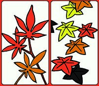
 Let's get some reader participation into the artistic process! What you see here are two different styles of maple leaves, and I have to choose one as a template for the rest of the maple suit. I kind of like them both, but I can't decide which one to use. So, you get to decide for me!
The design on the right is done in a traditional Japanese style, and the left is a modern, realistic pattern of my own design. The traditional card is very similar to how leaves are painted on screens & walls As Seen In Japan. But the other features leaves that actually resemble those of the Japanese Maple. Which will it be? Leave a comment with your favorite!
a) I like the realistic (left) one best.
b) I like the traditional (right) one best.
c) They both suck! You suck!


5 comments:
I like the one on the right. I like the movement it shows.
I prefer yours, but it looks like a pot leaf, with the 7 leaves and all...
I like the one on the left, but I would like to see more colors in it, such as in the one on the right.
I like them both for different reasons. Jenna's correct, the one on the left does look like pot. Maybe you should just make a separate marijuana card since that is obviously on your mind. Overall I'd say the one on the right. They look like susuwatari food!
i like the ones on the left because of the stems, but i like the colorfulness and veins of the ones on teh right! and the shadow, that's nice (it is a shadow right? the dark ones?) anyway. yes. i think you should combine them. :)
Post a Comment